
Assessing the utility of data visualizations based on dimensionality reduction
Published:
We human beings use our vision as our chief sense for understanding the world, and thus when we are confronted with data, we try to understand that data through visualization. Dimensionality reduction methods, such as PCA, t-SNE, and UMAP, are approaches designed to enable the visualization of high-dimensional data. Unfortunately, because these methods inevitably distort aspects of the data, these methods are receiving new scrutiny. In this post, I propose that dimensionality reduction requires a “probabilistic” framework of interpretation rather than a “deterministic” one wherein conclusions one draws from a dimensionality reduction plot have some probability of not actually being true of the data. I will propose that this does not mean these plots are not useful. Rather, to evaluate their utility, I will argue that empirical user studies of these methods will shed light on whether these methods provide more benefit or more harm in practice.
Introduction
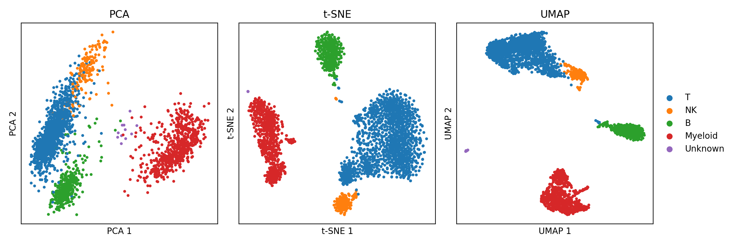
The advancement of technology has brought with it the ability to generate ever larger and more complex collections of data. This is especially true in biomedical research, where new technologies can produce thousands, or even millions, of biomolecular measurements at a time. Because we human beings use our vision as our chief sense for understanding the world, when we are confronted with data, we try to understand that data through visualization. Moreover, because we evolved in a three-dimensional world, we can only ever visualize up to three dimensions of an object at a time. This limitation poses a fundamental problem when it comes to high-dimensional data; high-dimensional data cannot, without loss of information, be visualized in their totality at once. But this does not mean we have not tried! The field of dimensionality reduction algorithms studies and develops algorithms that map high dimensional data to two or three dimensions where we can visualize it with minimal loss of information. For example, the classical principal components analysis (PCA) uses a linear mapping to project data down to a space that preserves as much variance as possible. More recently, the t-SNE and UMAP algorithms use nonlinear mappings that attempts to preserve the “topology” of the data – that is, that attempts to preserve neighborhoods of nearby data points while preventing overlapping dense regions of data in the output figure. An example of single-cell RNA-seq data from peripheral blood mononuclear cells (PBMCs) visualized by PCA, t-SNE, and UMAP are shown below (Data was downloaded via Scanpy’s pbmc3k function. Code to reproduce this figure can be found on Google Colab. Note, t-SNE and UMAP are being used to visualize the top 50 principal components from PCA.):
Unfortunately, because it is mathematically impossible to avoid losing information when mapping data from high to low dimensions, these algorithms inevitably lose some aspect of the data, either by distortion or ommision, when plotting it in lower dimensions. This limitation makes the figures generated by these methods easy to misinterpret. Because of this, dimensionality reduction algorithms, especially t-SNE and UMAP, are facing new scrutiny by those who argue that nonlinear dimension reduction algorithms distort the data so heavily that their output is at best useless and at worst harmful. On the other hand, proponents of these methods argue that although distortion is inevitable, these methods can and do reveal aspects of the data’s structure that would be difficult to convey by other means.
In this blog post, I will attempt to provide my views on the matter which lie somewhere between those held by the critics and proponents. I will start with a review of dimensionality reduction and describe how it inevitably entails a loss of information. I will then argue that dimensionality reduction methods require a different kind of mentality to use them correctly than traditional data visualizations (i.e., those that do not compress high dimensional data into few dimensions). As a brief preview, I will argue that dimensionality reduction requires a “probabilistic” framework of interpretation rather than a “deterministic” one wherein conclusions one draws from a dimensionality reduction plot have some probability of not actually being true of the data. I will propose that this does not mean these plots are not useful! To evaluate their utility, I will argue that empirical user studies of these methods are required to evaluate them. That is, we must empirically assess whether or not the conclusions practitioners draw from these figures are more often true than not, and when not true, how consequential are they.
For much of this blog, I will use data generated by single-cell RNA-sequencing (scRNA-seq) as the primary example of high-dimensional data which I will use in a case study addressing the risks and merits of using dimension reduction for data visualization. As a brief review, scRNA-seq data is structured as a data table/matrix where rows represent individual cells and columns represent genes. Each entry of the matrix stores a measurement of the relative abundance of mRNA molecules transcribed from a given gene in a given cell. scRNA-seq studies routinely generate data for hundreds of thousands of cells and provide gene expression measurements for tens of thousands of genomic features such as genes or isoforms. Thus these data are very high-dimensional. For a comprehensive review on RNA-seq, please see my previous blog post.
Dimensionality reduction almost always entails a loss of information
In this section we will review the task of dimensionality reduction and describe why it inevitably entails a loss of information. Before moving forward, let’s formalize what we mean by the “dimensionality” of data. For the purposes of our discussion, we will refer to data as being $d$-dimensional if that data can be represented as a set of coordinate vectors in $\mathbb{R}^d$. That is, the dataset can be represented as $\boldsymbol{x}_1, \dots \boldsymbol{x}_n \in \mathbb{R}^d$. Collectively, we can represent the data as a matrix $\boldsymbol{X}^{n \times d}$ where each row represents a datapoint. This description thus covers all tabular data. (For a more philsophical treatment on the notion of “dimensionality”, see my previous blog post).
The task of dimensionality reduction is to find a new set of vectors $\boldsymbol{x}’_1, \dots, \boldsymbol{x}’_n$ in a $d’$ dimensional space where $d’ < d$ such that these lower dimensional points preserve some aspect of the original data’s structure. Said more succintly, the task is to convert the high dimensional data $\boldsymbol{X} \in \mathbb{R}^{n \times d}$ to $\boldsymbol{X}’ \in \mathbb{R}^{n \times d’}$ where $d’ < d$. This is often cast as an optimization problem of the form:
\[\max_{\boldsymbol{X}' \in \mathbb{R}^{n \times d'}} \text{Similarity}(\boldsymbol{X}, \boldsymbol{X}')\]where the function $\text{Similarity}(\boldsymbol{X}, \boldsymbol{X}’)$ outputs a value that tells us “how well” the pairwise relationships between data points in $\boldsymbol{X}’$ reflect those in $\boldsymbol{X}$. The exact form of $\text{Similarity}(\boldsymbol{X}, \boldsymbol{X}’)$ depends on the dimensionality reduction method.
Note that if $d > 3$ then we cannot easily visualize our data as a scatterplot to see the global structure between datapoints. Thus, to visualize data it is common to set $d’$ to either 2 or 3 thereby mapping each datapoint $\boldsymbol{x}_i$ to a new, 2 or 3 dimensional data point $\boldsymbol{x}’_i$ that can be visualized in a scatterplot.
However, there is a crucial problem to visualizing data in this manner: it is not possible (in general) to compress data down to a lower dimensional space and preserve all of the relative pairwise distances between data points. As an illustrative example, consider three points in 2-dimensional space that are equidistant from one another. If we were to compress these down into one dimension then inevitably at least one pair of data points will have a larger distance from one another than the other two pairs. This is shown below:
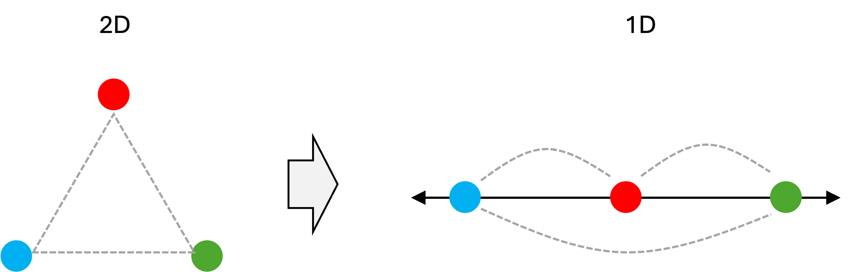
Notice how the distance between the blue and green data point is neither equal to the distance between the blue and red data points nor to the distance between the red and green data points as was the case in the original two dimensional space. Thus, the distances between this set of three data points have been distorted!
This problem presents itself in the more familiar territory of creating maps. It is mathematically impossible to project the globe onto a 2D surface without distorting distances and/or shapes of continents. Different map projections have been devised to reflect certain aspects of the 3D configuration of the Earth’s surface (e.g., shapes of continents), but that comes at the expense of some other aspect of that 3D configuration (e.g., distances between continents). A few examples of map projections are illustrated below (These images were created by Daniel R. Strebe and were pulled from Wikipedia):
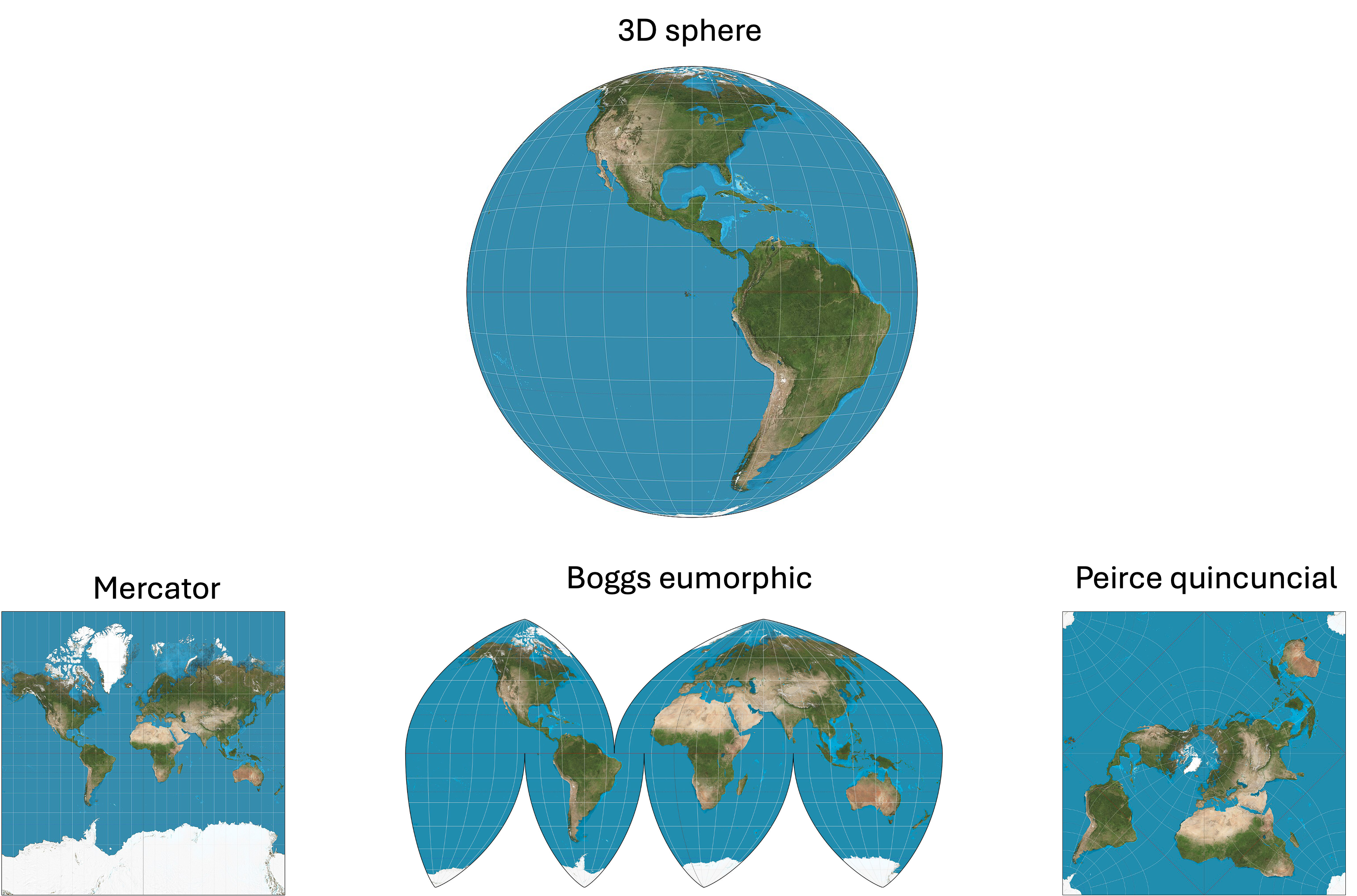
In fact, you can demonstrate this problem for yourself in your kitchen! Just peel an orange and attempt to lay the pieces of the orange peel on the table to reconstruct the original surface of the orange… it’s impossible!
It is almost always the case that some information is lost following dimensionality reduction. To visualize high dimensional data in two or three dimensions, one must either throw away dimensions and plot the remaining two/three or devise a more sophisticated approach that maps high dimensional data points to low dimensional data points to preserve some aspect of the high dimensional data’s structure (with respect to the Euclidean distances between data points) at the expense of other aspects. Exactly which aspect of the data’s structure you wish to preserve depends on how you define your $\text{Similarity}(\boldsymbol{X}, \boldsymbol{X}’)$ function described above! (Note, there are scenarios where it is possible to preserve pairwise distances between data points following dimensionality reduction, but those scenarios tend to be uninteresting. An uninteresting example would be a case in which all of your data points lie in a 2-dimensional plane embedded in a higher-dimensional space).
A probabistic mindset for thinking about inferences drawn from data visualizations
Now, I am going to build a framework for thinking about data visualization that will draw what I view as an important distinction between “traditional” data visualizations, such as heatmaps or barcharts, and data visualizations based on dimensionality reduction such as UMAP scatterplots. As a very brief preview, I will argue that traditional data visualizations enable one to make claims about the underlying data with 100% certainty whereas dimensionality reduction visualizations do not provide the same certainty.
Before we get going, I am going to make a statement that may appear obvious, but is important for laying the foundation for my views on dimensionality reduction: The primary outputs of a data visualization are a set of statements about the data. Take the following table and associated bar chart as an example to describe what I mean by this:
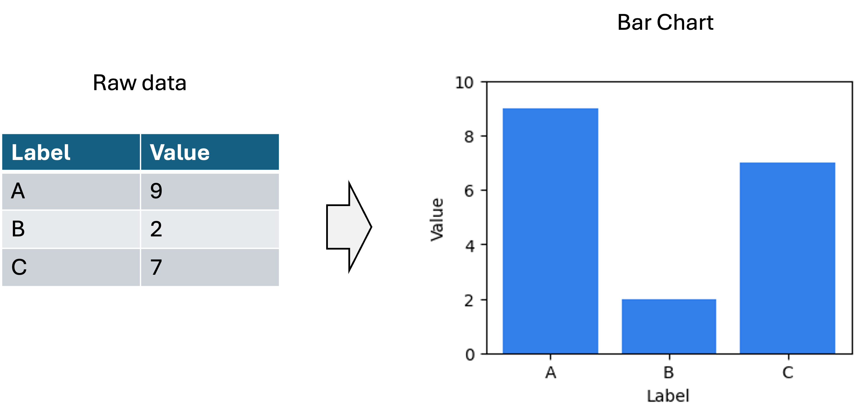
One statement about the data being conveyed by this plot is that Label A is associated with the value 9. Another statement about the data is that Label A is associated with a larger value than Label B. Below are a set of example statements about the data being conveyed by this plot:
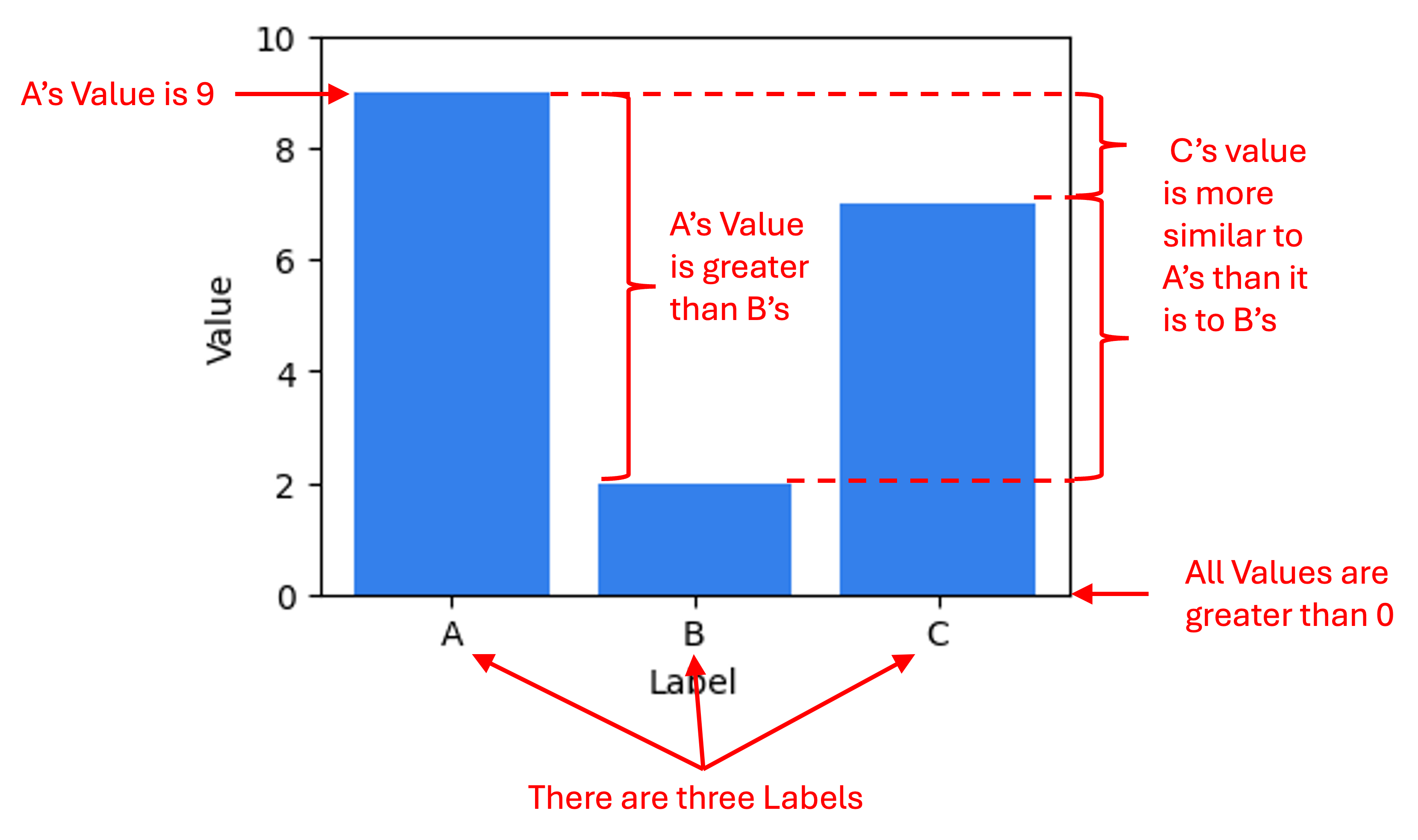
Note, I am describing statements about the data, not statements about the world. That is, the barchart enables one to make claims about the literal values stored in the data table from which this figure was generated. (The task of drawing conclusions about the world based on data and/or data visualizations is the task of science and statistics). Data visualizations make facts about the data easier to understand than the raw data by itself (i.e., large tables of numbers) because we human beings are visual animals.
For traditional data visualizations, statements about the data being described by the visualization are 100% certain to be true. For example, when one looks at the barchart above they know that Label A is associated with a larger value than Label B’s value (unless of course, there was an error in the generation of the visualization, but we will assume no errors were made here). That is because in traditional data visualizations, there is either a one-to-one or linear mapping between some aspect of the data and some visual or spatial element to the visualization. In the bar chart above, the mappings are as follows:
- Magnitude of Value $\rightarrow$ Height of bar (linear mapping)
- Distinct Label $\rightarrow$ Distinct bar (one-to-one mapping)
Because these mappings are invertible and deterministic, we can draw conclusions about the raw data with 100% certainty based on the visual elements in the figure.
Now, let’s turn our attention to data visualizations produced by dimensionality reduction methods. Let’s use a UMAP plot of the PBMCs shown above, but now let’s not color the cells by their respective cell type and let’s pretend we don’t know much of anything about these cells.
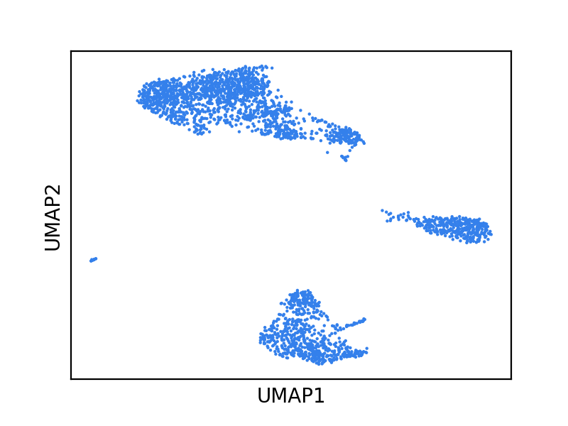
What are some (possibly incorrect) statements we might make about the data from this figure? Below are a few examples:
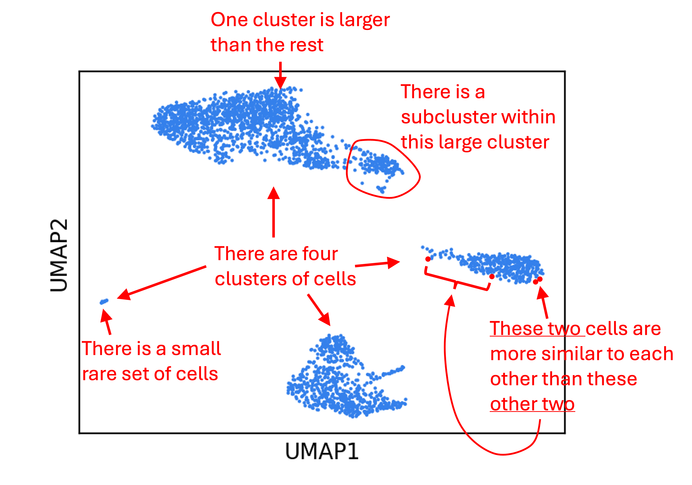
The problem is that many of the above statements are probably not true! For UMAP in particular, statements regarding distances are especially unlikely to be true. This is because, as we discussed before, dimensionality reduction methods distort the data. Statements we make about the data from this figure do not have the same gaurantee of truth as statements we made from the bar chart!
This brings us to a probablistic framework for thinking about data visualizations. Any statement about a dataset, $S$, drawn from a traditional data visualization, like the bar chart, has the following property:
\[P(S = \text{True}) = 1\]On the other hand, this is not the case for dimensionality reduction plots. Rather,
\[P(S = \text{True}) < 1\]Of course, the probability $P(S = \text{True})$ cannot really be defined in a frequentist sense, since $S$ either is or is not true. Rather, this is more of a Bayesian probability (i.e., a degree of certainty) that can be informed by looking across many plots with a similar feature as the feature being described by $S$ and asking: for what fraction of the datasets described by those plots is the statement $S$ true?
I concede that this “probabilistic framework” is a bit hand-wavey and not very rigorous, but to me illustrates an important distinction between plots based on dimensionality reduction and “traditional” data visualizations. Specifically, for dimensionality reduction plots, the statements one might draw from them about the data may be wrong. Said differently, dimensionality reduction plots help users draw uncertain inferences about the structure of the data whereas there is no uncertainty in a traditional data visualization.
Expert users of dimensionality reduction plots know this, of course, but use them anyway. Why? Well, because they claim that certain “classes” of statements are more often true than not and because of this fact, these methods are useful. For example, when it comes to UMAP, it is often true (but not always) that when you see distinct clusters in the scatterplot, those clusters are real characteristics of the data. Thus, one might say that a statement on clusters, $S_{\text{cluster}}$, is associated with a proability, $P(S_{\text{cluster}} = \text{True})$, that is high enough to be useful. On the other hand, a statement on distances between data points (especially long distances), $S_{\text{distance}}$, is associated with a probability, $P(S_{\text{distance}} = \text{True})$, that is far too low to be useful. The problem then is to determine which statements are more likely to be true than others for a given dimensionality reduction method.
Addressing the criticisms of dimensionality reduction methods
As I mentioned in the introduction, dimensionality reduction methods are receiving new scrutiny. Given my “probabilistic mindset” for interpreting data visualizations, I will attempt to summarize my understanding of certain criticisms of dimensionality reduction methods, especially non-linear methods like t-SNE and UMAP:
Concern 1: Distortion caused by popular methods like t-SNE and UMAP are too severe to be useful: That is, distortion of the data is so severe that practically any interesting statement $S$ that one might make from such a visualization is associated with too low of a probability of actually being true about the data to be useful for anything.
To this concern, I am undecided and I will address it more thoroughly in the following section. To preview, I believe that the best way to assess dimensionality reduction methods is to employ user studies. Do these plots lead to new insights in practice despite the fact that they distort the data? Do they lead to more good than harm?
Concern 2: We don’t know what inferences can be drawn reliably from these plots: That is, we do not have a deep enough understanding into the classes of statements that have high or low probability of being true. Without this understanding, we cannot use these plots effectively.
I mostly agree with this statement. The objective function of t-SNE, for example, is mostly built upon heuristics designed to generate a figure with certain properties. For example, the use of a t-distribution in the underlying model is motivated by the fact that it pushes data points apart in the resultant low-dimensional space and avoids overcrowding of data points. In my opinion, this is not really based on sound statistical theory. Similarly, UMAP assumes certain characteristics of the high-dimensional data that, as far as I know, are difficult or impossible to test. For example, UMAP assumes that “The data is uniformly distributed on Riemannian manifold”. I’m not sure how, in general, one can know this without a very sophisticated understanding of the underlying data-generating process.
All of that said, there is ongoing research to either develop new dimensionality reduction methods that are easier to interpret or to help users more accurately interpret plots generated by existing methods. For example, the recent method, PHATE, claims to better preserve continuums of data points in the high-dimensional space. DensMAP claims to better preserve regions of high or low density. Suprisal Components Analysis (SCA) claims to better preserve small clusters. scDEED identifies features in dimensionality reduction plots that are misleading.
Concern 3: Any visualization in which there is uncertainty around what it says about the data should be avoided: The argument here is that it is too easy to misinterpret and misuse any data visualization technique in which one can make a reasonable statement about the data, $S$, but that $P(S = \text{True}) < 1$.
The concern here is that if a plot does not provide certainty into the data that it describes, then it is too easy to fall victim to confirmation bias when interpreting that figure. I admit I fell prey to this myself. In a paper I led presenting a cell type classification algorithm, called CellO, I made the following statement based on a UMAP plot (referencing Figure 7): “CellO annotated many of these cells as pancreatic A cells (a.k.a. pancreatic alpha cells), which is plausible owing to both their close position to annotated A cells according to UMAP, which is known to preserve some level of global structure in high dimensional data (Becht et al., 2018)…” Granted, this statement is not very strong, I nonetheless ask myself whether what I saw in that UMAP plot is what I wanted to see? Indeed, because these figures may make us more prone to confirmation bias, I am sympathetic to the argument that we should avoid them altogether. At the very least, one should use extreme caution when using them and make sure to confirm any hypotheses generated from these figures using orthogonal techniques. I know I will pay more attention going forward.
User studies may be the optimal way to assess the utility of dimensionality reduction plots
While recent studies, such as studies by Chari and Pachter (2023) and Huang et al. (2022) evaluate dimensionality reduction algorithms quantitatively (and are very valuable studies), I argue that these studies don’t directly address the fundamental question regarding whether these methods lead to more harm or benefit. Because statements about data are the primary output of a data visualization, it is those statements that we should be evaluating. That is, even though it is established that dimensionality reduction methods distort the data, the question remains (in my mind) whether or not the statements that practicioners in the field draw from these plots have a high or low probability of being true. Do these plots lead to new insights in practice despite the fact that they distort the data? What alternative visualizations would provide the same insights with more certainty?
I am not an expert in how to conduct these kinds of studies and I am not sure what the best strategy would be, but I envision something like the following: Gather a group of scientist volunteers in some specific field and present them with a dimensionality reduction plot (e.g., a UMAP plot) for a dataset from a domain that they are unfamiliar with. Next, ask each volunteer to list statements/hypotheses they have about the data from that figure. Finally, evaluate how many of those statements were actually true within the data or were not true? What alternative visualization methods would have led the user to the same correct hypotheses, but avoided the incorrect ones? Were there certain categories of statements (e.g., related to clusters) that tended to be true and others (e.g., related to distances) that tended not to be true? Of course, this would be a fairly qualitative study, but perhaps it would shed light on how these plots are being used in the field.
Some thoughts on best practices for using dimensionality reduction plots
I propose that if one seeks to visualize their data with dimensionality reduction, they should use multiple methods in parallel. Because any statement, $S$, that one draws from these figures has a probability of not being true, it helps to assess whether other dimensionality reduction methods lead to the same statement. If many different methods all support $S$, then perhaps it is more likely to be true than if only one method supports $S$. That is because, as long as the methods are “orthogonal” to one another (i.e., are grounded in different theory or approach), then it would be quite a coincidence that $S$ is supported by multiple methods, but not actually true. Viewing these plots requires one to have a “probabilistic mindset” that is not needed for traditional data visualizations.
As an example, let’s look at another single-cell dataset from differentiating myeloid cells published by Paul et al. (2015). Below, I visualize these cells using six different dimensionality reduction methods: PCA, t-SNE, UMAP, Force-directed layout of the k-nearest neighbors graph , PHATE, and Surprisal Components Analysis (SCA) (Data was downloaded via Scanpy’s paul15 function. Code to reproduce this figure can be found on Google Colab. Note, t-SNE, UMAP, and force-directed layout are being used to visualize the top 50 principal components from PCA.):
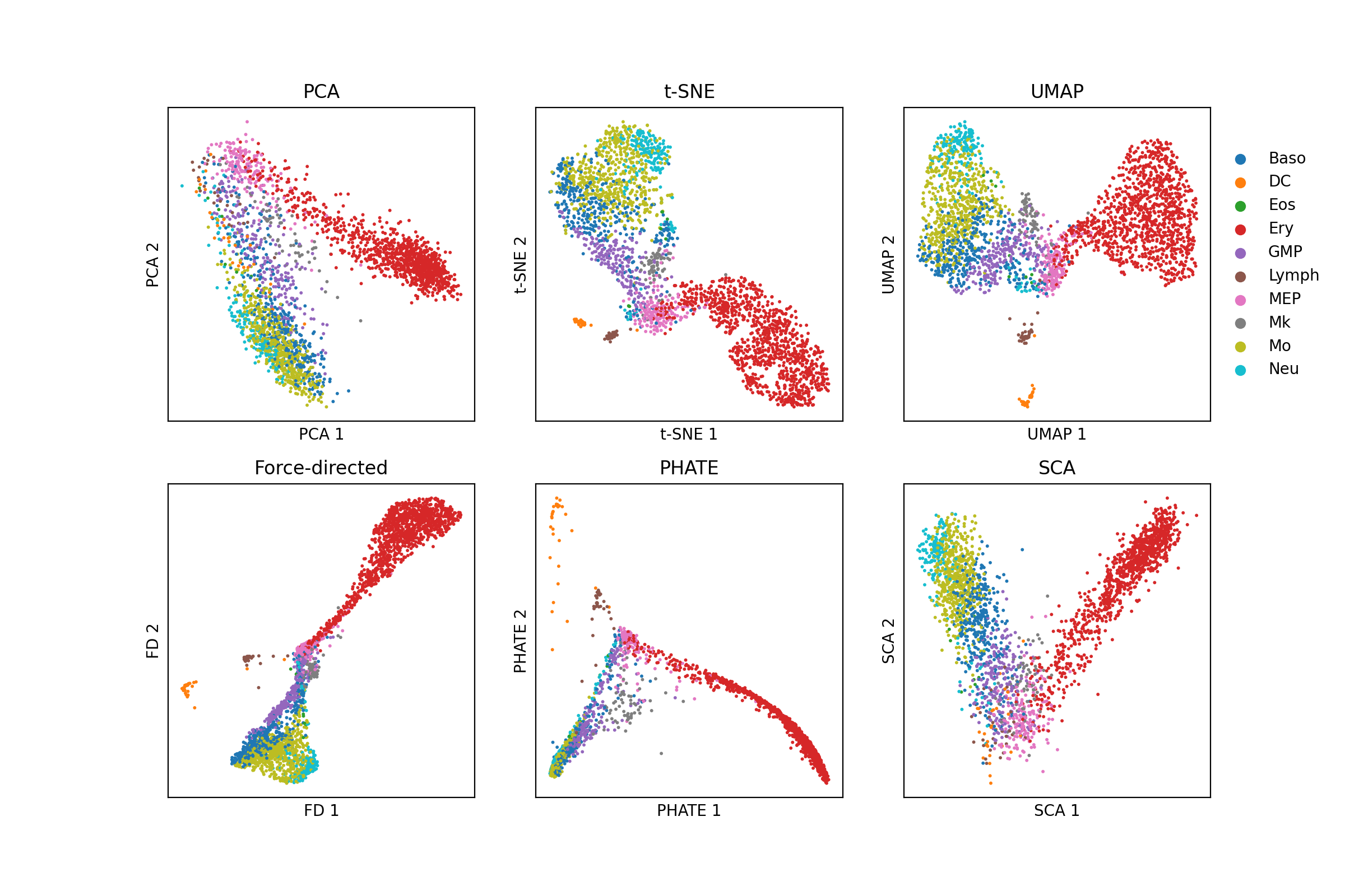
Note that all of the figures here present a continuum of cells originating at megakaryocyte/erythrocyte progenitors (MEP) and extend outward along two “branches”. Because this is featured by all of the plots, I think it is a reasonable hypothesis that there is indeed a continuum of cells starting from this cell type in the high-dimensional gene expression space. But of course, this may not be true. In my analysis, t-SNE, UMAP, and force-directed layout are all operating on the top 50 principal components from PCA, so they are not perfectly orthogonal. Similarly, UMAP, PHATE, and force-directed layout are all operating on a k-nearest neighbors graph. While t-SNE does not explicitly operate on a k-nearest neighbors graph, its use of centering a unimodal distribution around each point to capture a certain density of neighbors is effectively operating on a k-nearest neighbors graph. Thus, these methods in particular are even more similar to one another.
In conclusion, no statement can be made with absolute certainty from dimensionality reduction plots. We must be dilligent in confirming any hypotheses generated by these methods using alternative, statistically grounded approaches. Lastly, when using these methods, we must remain self-aware enough to avoid the confirmation bias that these methods may promote.
Final note: Please let me know if I mischaracterized any work cited above.